Sunday, 30 June 2013

Design Project- How technology affect our life

Summary

Nowadays development of technology become more advance and it's having a big influence in our society, our life. Parents, friends, foods or anything that around us every day but our people just only focus on the phone, Ipad games, chatting with people, is like a drug but we still like it, and make us forget or ignore anything that happened outside. Some of them are suffer for it, even though is pain but still can't get rid of it, technology are making our society into more machinery, touch screen, advance city, robots all in machine form, even we wish want to turn ourselves into a half robot-man. Oxygen cylinders, inside it are lots advanced technologies, which means nowadays people can't really live longer without those high-techs; it's become part of our life, like oxygen. There is a metaphor that people can died for it, as we know that how many people been died for it, even though people don't want it but still lots of seduction that seducing us, friends, society, needs and others. 

First sketch: 
(Sir, my scanner suddenly can't use so I'm been force to use my phone snap picture first..if possible i will scan it on Monday ASAP)
I want to compare from the old generation and young generation, to show that how technology really affect us, we leave our parents alone in nursing house, we chat with each other even though we are together. This idea was came out when i'm staying with my parents, my younger brother was ignoring my mom and keep playing the I-pad, so this is real thing and still happening in our society.


Second sketch:
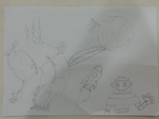
That is bridge that people chasing for the technology, and those old stuff was leaving behind. They want to become updated person, living in advanced city, some of them was falling down but still no one giving a helping hand. 


Third sketch:
Technology is making us more progress, we can even reach moon, making a space trip. It's also connected to every where on earth, we can make a cross-border business, face to face chat with friends. So basically this is to show the benefit of how technology affect our life.


Fourth sketch:
The idea was same as the first sketch, left side is modern city, modern people, the right side is advanced city, all the things are in machine form, human also. 


Firth sketch ( final project):
People are suffering for it, those hand are like seduction to seduce us fall into it, even though we need oxygen but still, inside it we already can't live without those high-technologies. 

Project process
step 1


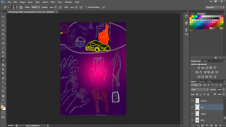
Scan it inside the laptop and click <Image> on the top and change the size, width and height according to what lecturer told us. Actually there was a mask cover in my original sketch, but then I feel like it's no point to show it so at the second process I erase it.

step 2


Copy the sketch layer first then turn the background into purple color, and in the center brush it with pink color, I try to make the background into a bit darkness looks like some scary drawing.

step 3
Then put back the sketch layer on the color layer, as the line that I sketch isn't too obvious so during the color step, I tried back to the sketch layer and make some of the line into more thick and obvious.

step 3

Start coloring it, firstly using brush tool and color on the part I want, then click a box that a bit up on the layers side, there's a box < Normal>, this part can make some change on the part that we color it just now, some effect will appear on it.

step 4
This body I color it first, then go back to the sketch layer and used quick selecting tool to select the body part and paste it on the body color layer, but still not so obvious, so I used the <thresold> key to make it more dark and obvious, the key is on the right down side a small circle with black and grey color, this is use to make some effect on the picture.

step 5
After color it, I tried to make it more 3D and some shadow, so I double click the layer, a box came out then choose drop shadow, this is to make a shadow on the particular part, more 3D looks like. Using <Smudge tool> also to make the part extend a bit the color, pull it on the color and it will extend a bit, we can make it sharper or longer so it will more creative

step 6
Inside the oxygen cylinders I tried to make some real oxygen inside it, double click the layer choose the <Pattern Overlay>, we can choose some of the pattern and it will appear on it to show some effect like mine is bubble, tried to make some real oxygen inside it.

Final work

Artist Statement
Basically, the man in the middle is the main point to show that there are few seduction around him and he's suffer for it, as I said technology nowadays make us can't live without them, so oxygen cylinders is to explain even though we need air but still inside there we wish those stuff can be together with us, even when we died, sarcastic but is real. We can't get rid of technology.

 Albert Einstein said: "I fear the day that technology will surpass our human interaction. The world will have a generation of idiots."


Tuesday, 25 June 2013

Design principle and elements part 2

Basically this is a robot face (upside there's eyes and down there is a mouth)...from design principles I using center and balance based on my painting. The eyes was a little bit mistake when the time I draw it, I know it's a bit childish but I get the idea from a anime. Design elements I used line and color to show that it's look like a robot, I tried to color the box inside the mouth but i thought that would be a bit confuse so i change it to some random pattern. Hope you guys can get it.

Wednesday, 12 June 2013

National art gallery- A paint that inspire me~~~

It's hang on the second floor, the first time I saw it my parents was the first thing came to my mind. 

An ink painting, background is white, when you look at it at the side angle, it's just look like several mountains. There were three big mountain overlapping by few hills, biggest then middle then the smallest hill, two of the mountain were at the left side and the other right side, in a triangle shape.

My first thought after saw this ink painting, my parents came into my mind, because I saw that the right side mountain looks like a guy kneeing down, and the left side mountains look like two old parents. I feel that the guy was so sad and probably his parent were gone, the guy just look so hopeless, he tried to talk, to share something to his parents but was too late, the guy could just kneeing down doing nothing.

Why I got such feeling, because from the time I be sensible I just realize that filial to our parents is can't wait until we need them, not only appreciate when we lost them. Nowadays I feel that parents just only need us stay beside them, is just that simple, even though we have free time to join friends or clubbing, but we forgot that someone was waiting us, waiting for our caring. When I was a kid I used to argue with my parents oftentimes, till they cried and punished me, but now I started realized that actually they need me anytime. 

I don't know whether this can be count as an inspiration from National Art Gallery, but it really make me feel so touch about this ink painting,and I never thought that art painting can really inspire people to think more deeper. 

Tuesday, 11 June 2013

Exercise 6: Art movement

My art movement~~International  Style ( Architecture)

1920s in Western Europe, a different art was born out, International style. Its whole new design completely subverts compare to the past generation. Its principles and properties affect the whole world adopted it in the building area, so that's why we called International Style, also called as Modern movement. 

This whole new type of art movement even though appeared from 1920s, but in 21st century nowadays is became more popular and more prominent in anywhere like house, office, military bases or government building. It’s represent national, cultural or even historical uniqueness. Henry-Russell Hitchcock and Philip Johnson, both of them was writer about this new type of art, they divided three essential characteristics underlying the International Style:
1-Perception of architecture as volume rather than mass
2-Regularity instead of symmetry 
3-Avoidance of extraneous ornamentation 

Skyscraper is the most popular name we can hear until now, U.S., U.K. , Beijing and Francis these countries having their own popular building to represent their national. Innovative, attractive, prominent these elements could be found in those building design. There are no more purely design like a upright building but more highlighted in structure building, like curve or interleaved could be built up nowadays.

Walter Gropius was the founder and primary influence for the International style; he believed that to build a building is a highest performance of art so it should be included some skill like artist, architect and craftsman. International style for me is representing modern, high grade of life, it's made me feel that I finally have my own house which is under my style to build it up. The building style is completely built by our opinion, our own style, that feeling is more like " hey, look at me, my house, is my style, is mine and nobody has it", instead of others this kind of art is more real, we can feel it inside and even change it. International style is the most different style among all the art movement, is more realistic to our life.

KLCC, Taipei 101 building, Tokyo tower and Eiffel tower those building have the same feature- high. Those building influence the International style into another realm, to build as high as they can, not only for the view or tourism, but also a symbolic of national. 21st century is the most prosperous century for develop International style where we can see it anywhere.

International style, I love that…and I wish to live in….


Monday, 10 June 2013

Story telling...

Six children watching at somewhere, facing the camera. Happy face, afraid what they looking at, excited to the new things, worry about it whether it's going to hurt them or not, this is all i feel it from the picture, from the kids.

The two girls start from the right side, they were excited looking at the camera, full of cuteness and simple from their faces, kids' smile are the most powerful weapon to make us feel warm. Even though they were looks like poor kids, not enough good of their life, look at their clothes, they looks like so poor, unlike other kids in Malaysia wearing a NIKE clothes. I feel that even though they poor, but they appreciate it, it's part of their life and they accepted it, happy to live.

The middle kid, she looks like the older one, and feeling like "don't come here, go away", she looks so scare of strange things. The middle kid make me feels that she was went through some things happened around her and made her feel so strange and full of alertness to everyone. Hopeless, sadness, hurt can be seen on her face, she feels that life is nothing left more except for sadness.


The others look like they didn't even know where was happening, only black and white, kids and reaction, poor clothes, it’s happen in Indonesia or Africa I guess, it’s represent how poor are the people at there, by using kids to show it without words, cause kids are never lie through their expressions, they made me feel that those countries are suffering but me, myself are enjoying those nice foods, air-con, parents’ love which we all didn’t even appreciate it, those things are the needs for them, for those kids from poor background. They can’t even know whether today they can survive or not, I feel so guilty and sadness, warm, and start to help them through different ways.

Source from :http://www.photographymojo.com/2010/12/lets-stay-together-group-photography/
Title: Railway children
Photo credit by Mike Snead


Tuesday, 4 June 2013


Fourth exercise: Color’s meaning, my beloved color


Purple represent powerful, leader, royalty, nobility, luxury, mystery. This few representative of purple could be found out at any website, normally purple are mystery, a symbol of power in my personal view.

Purple normally is use for meditation, seeking inspiration, to give people calm down and start thinking, is kind of spiritual fulfillment. As we can see, from the past purple has been used as a symbol of power, also in most of the magic performance purple had been used as a symbol of mystery.

How purple form? Normally is a combination between blue and red, from the research I learned that red is a focus point, represent active and dynamic, while blue can be function as a calming process, cooling down people feeling, expansive as well (here might be saying that blue color can also make people express their feeling ).

Purple can remove our worry, to calm people down or even can affect depression, most of the gemstones is made by using purple color, it’s associated with mysticism and purification, most of the meditation also using lots of purple color as a support tool.

I found some similarity between purple’s meaning and my personal characteristic, those online research said that people who likes purple are sensitive and compassionate, understanding and supportive, think of others before us. My personal view for why I chose purple as my favorite color, not only it’s mystery and powerful, as the research said that sometimes I was like so sensitive, so care about how people think of me, compassionate will be like when I saw those beggar my rational and emotional will argue whether I should donate some money to them or not.

At the last, purple I think that it is a quite controversial color compare to others, it could be good for express also can be affect depression, but I like it, mystery and royalty, like a batman(he should turn the black into purple…).

Here are the references:

Monday, 3 June 2013

Second exercise: Design principles and design elements


Design principles, which mean that a concept, a main theme or stereotypes to lead out the elements, to arrange the structure of elements, and mix it together to become a design, an art.
 It also could affects the art performance, or maybe bring out some message through the art.
There are some principles that I get it from website and I will explain some of it.

-Center of interest: an area that might be straight away attract people attention. It is the most important part, by using some contrast color or the place it express itself.
-Balance: feeling of what we see on the art, shapes, colors, values, forms, which can be used to present, also it could be evenly balanced and also un-evenly balanced.
-Contrast: It used to create an area of emphasis, it shows the differences between each shapes or color as well, also to lead out the main object.
Harmony, direction movement, rhythm, these are also including in design principles.

Design elements, we can say that the things to build up a painting, an art. It is just like tools, line, color, texture, shape, form, value and size, these seven elements are the most popular or the most important tools that can never forget to design.

-Line: It can create texture, to describe the outline or a shape, it can be like thin or thick lines, actual, vertical or horizontal and contour lines.
-Color: Have three properties (Chroma, intensity and value) , color also can be refer to the hues.
The most popular thing about that is color wheel, to show how the color works compare to others or it will become when you mix it, also to show a contrast between them.
-Texture: To show the roughness or smoothness in objects, it can be real or even implied by using different medium.
-Shape: Two dimensional line but no any form or thickness, is flat, in two categories (geometric and organic)
-Form: Three dimensional object, have volume and thickness. It also can be say that a 3-D effect by using light and shading techniques, it can be viewed from different angle.
-Value: Contrast normally is the extreme changes in values, normally white and black two color will be using, also refer to light and dark in a design.
-Size: Objects, lines or shapes’ variations in the proportions. It is also simply the relationship of the area occupied by one shape to that of another.

In the conclusion, design principles can be said that what we can do to the design elements, but design elements are to create the design principles, so this two options must be there while doing design...they can't just separate.

These are the website/ references that I search and get the meaning from there:

First work-Abstract design

Abstract design
Firstly, I'm not that good at drawing so please be patient with my drawing for my design class lecturer and those viewers.
This is my first drawing, first time using Photoshop, actually this is an Universe, at the first time i tried to do the normal one like those dark color of the background and some rocks and some aerolite, but then my girlfriend inspired me to turn it in others contrast colors.The white things are rocks and aerolite, and those are  nine planets and the sun. Try to imagine it and enjoy it.THX